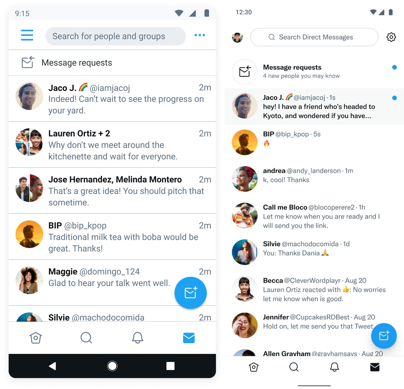
Twitter is launching a redesigned user interface for DMs on Android, the company announced on Friday. Starting today, Twitter users on Android will see a more modern interface for direct messages that is consistent with the rest of the app. With this rollout, Twitter is bringing the Android experience on par with its iOS interface.
The refresh also brings an improved composer, as well as better tweet forwarding, context for message requests and clearer read receipts. The social network is also introducing improvements to the interface’s scrolling performance and responsiveness.

Image Credits: Twitter
Now, when Android users open their DMs, they will no longer see the boxy design they’re used to. They will now also see if they have received message requests from people they may know. The three-dot menu in the top right corner of the UI has also been replaced with a Settings symbol.
Twitter says it saw a need to improve how people use DMs on Twitter on Android devices, which is why it decided to revamp the interface. The Android refresh is arguably long overdue, considering that iOS users have had access to the redesign for quite some time now, while Android users were stuck with a somewhat outdated one.

Image Credits: Twitter
The launch of the new interface comes as Twitter has been working to improve the DM experience for users over the past year. In February, the company rolled out the ability for users to pin up to six DM conversations to the top of their inbox for easy access. The social network also rolled out the option for users to search for specific messages in their DMs in March.
Last year, Twitter made some long-awaited changes to DMs, including the ability to DM a tweet to multiple people at once in individual conversations. Also, instead of timestamping individual messages with the date and time, Twitter started grouping messages by day to reduce timestamp clutter.
Twitter is rolling out a refreshed user interface for DMs on Android by Aisha Malik originally published on TechCrunch
DUOS


