The Kindle turned 15 this month. It’s been a strange ride for Amazon’s first hardware device. CEO Andy Jassy gave the e-reader a rare bit of love in last year’s shareholder letter, noting:
Our first foray into devices was the Kindle, released in 2007. It was not the most sophisticated industrial design (it was creamy white in color and the corners were uncomfortable for some people to hold), but revolutionary because it offered customers the ability to download any of over 90,000 books (now millions) in 60 seconds—and we got better and faster at building attractive designs.
In the context of the letter, the device is simply a prelude. It’s the first step into a world that would include tablets, an army of smart home products, wearables and one ill-fated smartphone. It’s kind of perfect, really, for a product line that conquered the world and then took a backseat to the rest of Amazon’s offerings.
Before the September Kindle Scribe announcement, the line hadn’t received a SKU since the 2016 arrival of the premium Oasis. Sure, there have been refreshes over the years, but not even those have arrived with any sort of regularity. Prior to the long-awaited Paperwhite update that brought USB-C to the line roughly this time last year, Amazon hadn’t announced a single device refresh since summer 2019.

Image Credits: Brian Heater
Can you blame them? For starters, people keep their readers around for a long time. The batteries last forever, and they’re rarely subject to the same sort of daily abuse as our smartphones. Even more importantly, while Amazon’s isn’t the only game in town exactly, it sure feels like it sometimes. Sony, the one-time maker of very good readers, tapped out for good in 2014. Barnes & Noble — while not out of the Nook business entirely — seems to only exist to drop a minor refresh every few years, so don’t forget about it entirely.
Here in North America, Kobo presents the closest thing to actual competition for Amazon’s e-reader dominance. The Canadian-founded, Japanese-owned firm makes good readers that can hold their own against the Kindle, but Amazon utterly dominates the marketshare here in the States. Granted, these numbers are old (from 2018), but this study puts Amazon at a >80% marketshare in the U.S. If the iPhone commanded that much of the market, do you really think Apple would be falling over itself to present a major update each year?
But Amazon’s September device event brought two surprises. First, the entire thing was far more subdued than past years, with fewer products being announced. Of course, Amazon’s not alone in slowing down its product inventory ahead of uncertain times, and subsequent layoffs in the company’s devices division seem to point to that trend maintaining for the foreseeable future.
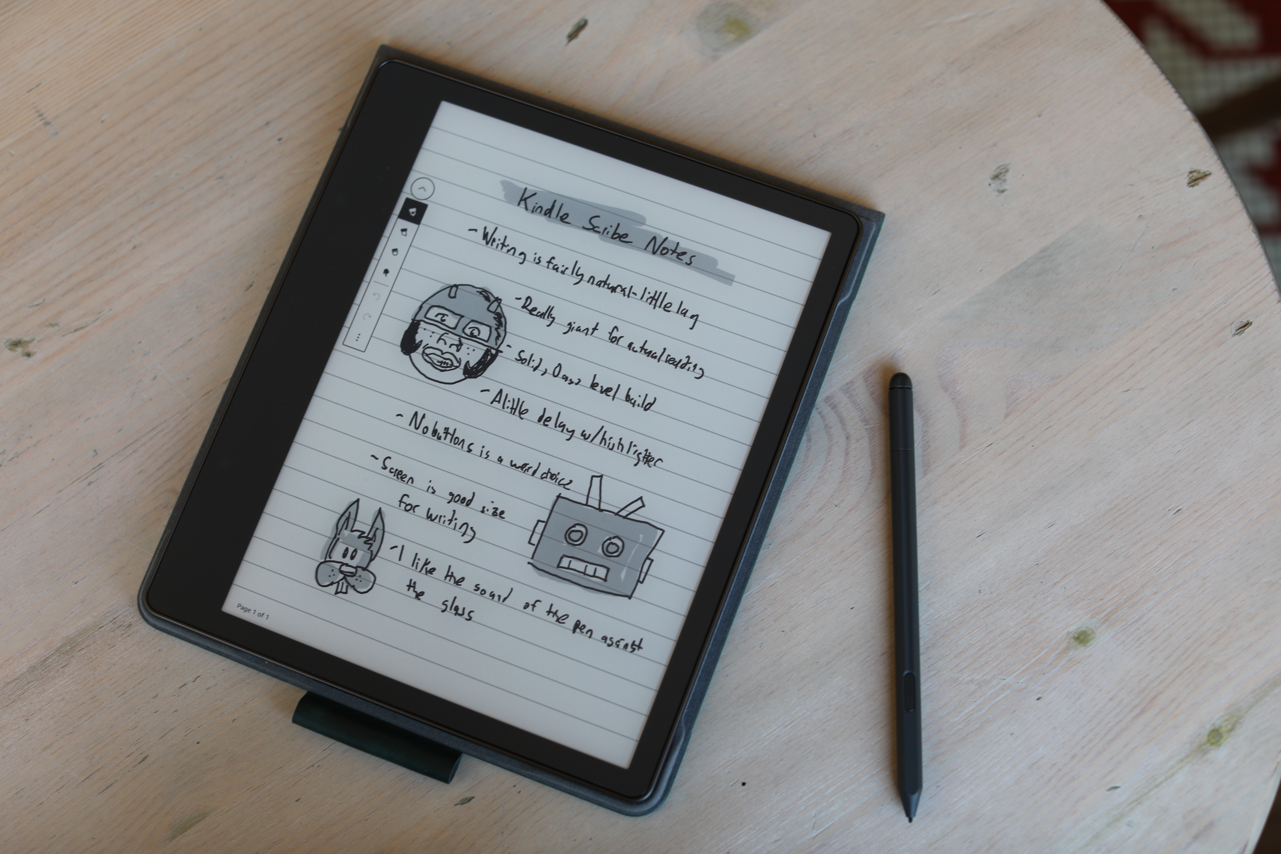
Image Credits: Brian Heater
Second, we got a new Kindle. Not an update to an existing Kindle, mind. A genuinely new product — and really, an entirely new product category for the line. For the duration of the Kindle’s life, it’s been a content consumption machine. It’s a place to read what other people have written. And while it’s understandable that the company dropped the physical keyboard found in its earliest iterations, the E Ink touch screen has been more miss than hit when it comes to typing.
The Scribe adds a seemingly simple feature that users have no doubt been requesting for the better part of a decade: pen-based writing. I spoke with the company ahead of the official announcement, and here’s where I landed with regards to why it took so long to implement:
The company says the fact that it didn’t launch a Kindle with this functionality earlier isn’t for lack of trying. Rather, it was important it get the tech right, while maintaining key features like front lighting and the line-wide 300 ppi display (compared to 226 on the reMarkable 2). Given the $90 price bump over the previously most expensive Kindle (Oasis), it certainly makes sense that the company would want to maintain those line-wide features. Amazon says it worked with E Ink Holdings (EIH) on the display, which it then customized to hit those specs.
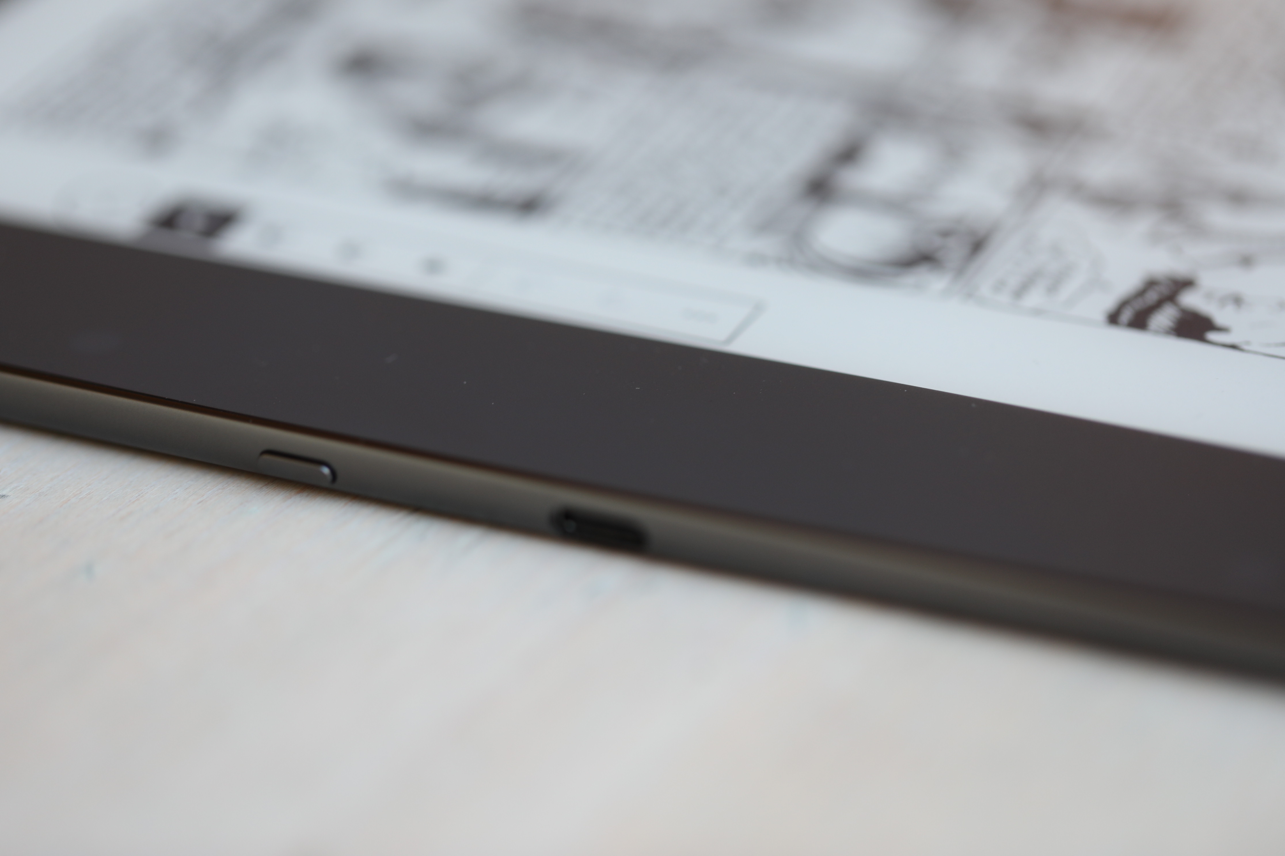
Image Credits: Brian Heater
I will say, e-book reader owners are a forgiving bunch. Lags and refreshes come with the territory on e-ink devices. There’s a lot of stuff users wouldn’t put up with in other products, partly because they’re aware of the benefits of the technology (clearer/easier on the eyes, wildly good battery life) and partly because, well, it’s the only game in town. Whether you go Kindle or Kobo, you’re effectively working with the same basic technology.
Writing lag, on the other hand, is a different beast entirely. It’s the sort of thing that makes you want to huck your expensive new piece of plastic and glass across the room in a fit of rage — barring that, if the experience is bad enough, you’ll probably try it a few times before giving it up all together.
I’ve been pleasantly surprised on that front. I admit my expectations were lowered by more than a decade of using e-ink screens, but the Scribe provides a good note-taking experience. In fact, there’s a lot present here that will come as a pleasant surprise for anyone who has not updated their e-reader in a few years. While the experience continues to remain distinct from that of a standard tablet, Amazon has added little touches here and there to drag the product line kicking and screaming into 2022.
This starts with the design. The Scribe borrows a number of key elements from the Oasis. It’s amazing how much a flush glass display contributes to the overall premium feel. Also, like the Oasis, one of the side bezels is considerably larger than the other, presumably so you have a place to rest your hand while holding it that doesn’t trigger the touch display. Unlike the Oasis, however, there are no physical page-turn buttons on the surface, which feels like a missed opportunity.
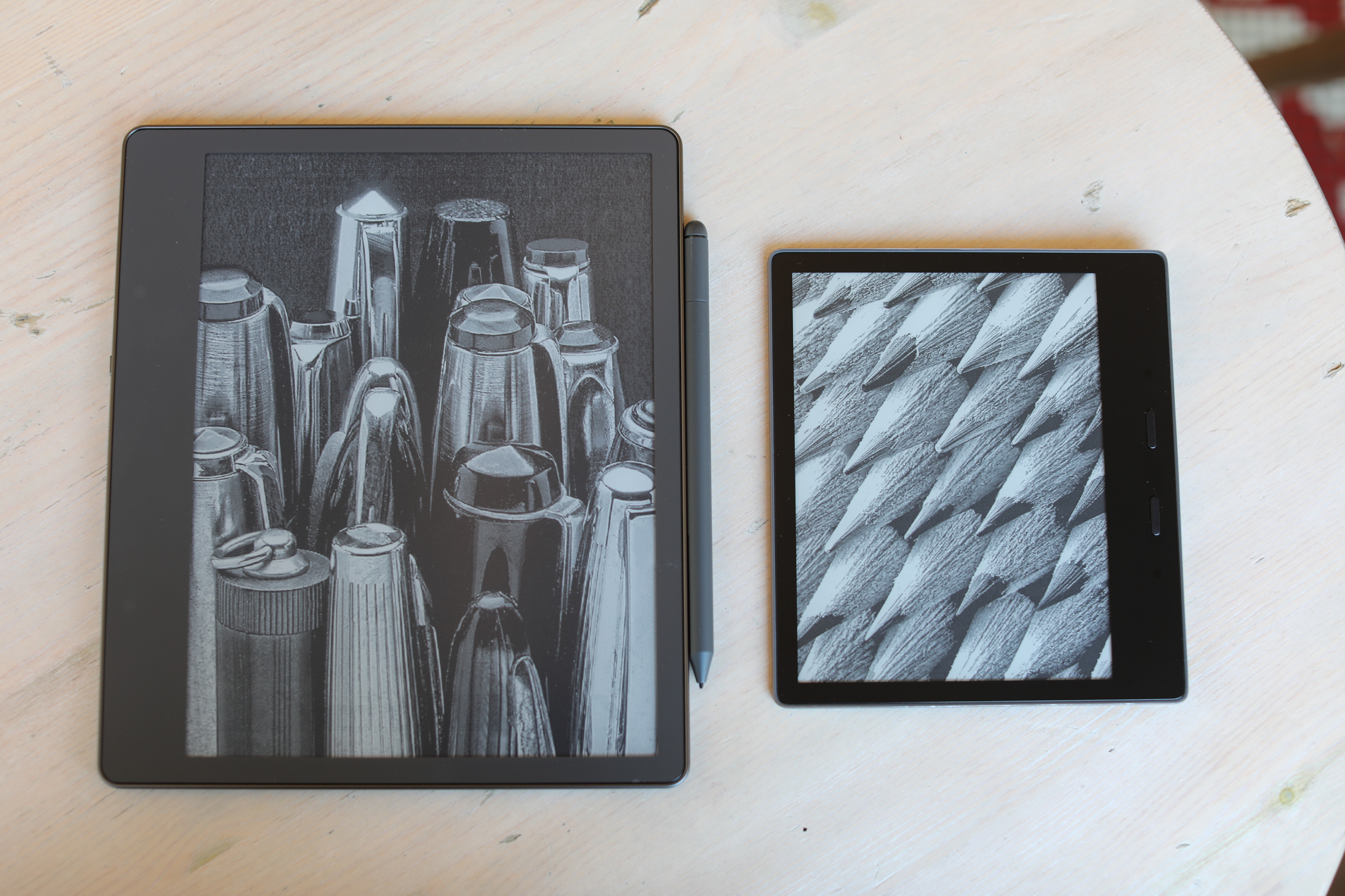
Image Credits: Brian Heater
At 10.2-inches, this is the largest Kindle display by a considerable margin. Keep in mind, there was a relative statis in screen sizes for much of the product’s existence. The Kindle started off as a 6-inch device and the entry level model has stayed there for a decade and a half, as though the company had found a kind of platonic e-reader ideal.
There have been derivations from the number, of course. The Kindle Oasis 2 pushed the screen to seven inches, and the latest Paperwhite isn’t far behind at 6.8 inches. But to get anywhere near the Scribe’s size, we’re going to have to travel back in time even further to the DX. Introduced in 2009, the short-lived product is a bit of an anomaly on the Kindle flowchart. With a 9.7-inch display, the device found the company stepping outside the Kindle’s core book reading functionality.
The pitch largely revolved around PDFs and newspapers. 2009 was a time when it seemed there might still be a viable market for people who really wanted to read broadsheets in something close to their original form. The viability of that market aside, the truth is the technology just wasn’t ready. As frustrating as e-ink can be today, dealing with images was a nightmare then, both in terms of resolution (everything felt like one of those WSJ stipple drawings) and refresh times. A full-page refresh for every fraction of an inch an image was moved is my version of walking to school uphill both ways in the snow.
Also, much like smartphone space, larger screens required larger device footprints than they do today. The Scribe is a large screen reader that doesn’t feel like a brick. I mean, I certainly can’t carry it around in a pocket the way I can other Kindles, but I don’t feel silly reading on it during a long train ride. At 433 grams, it’s a touch lighter than the 10.2-inch iPad (487 grams). The dimensions are similar, as well, with a different, reading-focused, aspect ratio. The Scribe is 9.0 x 7.7 x 0.22 to the iPad’s 9.8 x 6.8 x 0.29.
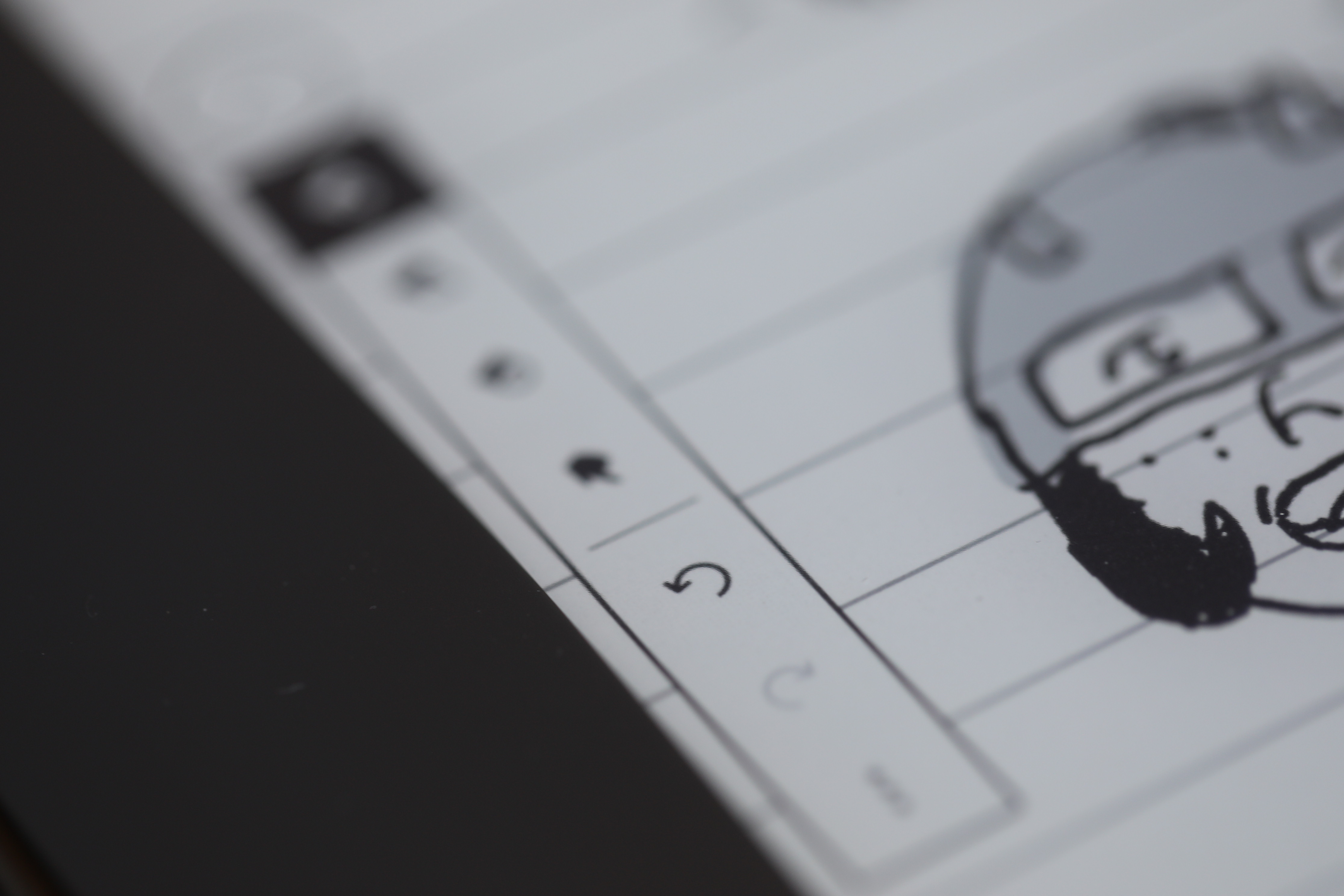
Image Credits: Brian Heater
The 9.7-inch Kindle DX, on the other hand, measured in at 10.4 x 7.2 x 0.4 inches, with a weight of 535 grams. Perhaps the DX was simply a product ahead of its time. It was an idea for which the hardware simply wasn’t quite ready. Newspaper purists (well, not purist enough to still want a Kindle) may have been an evolutionary dead end, but plenty of folks — especially those with vision impairments — could have benefited from a larger screen.
Certainly, the larger screen makes a lot of sense on a product like the Scribe that’s designed specifically for handwriting and drawings. It does fill that long dormant gap of a truly large-screen Kindle, but the $340 starting price is almost certainly going to be a stumbling block for many. The former highest-end Kindle — the Oasis — has a starting MSRP of $250, and as I type this, Amazon has it marked down to $165.
Some of the Kindle’s most premium design elements have become a foundational piece for the Scribe. The rear of the device is all metal — almost a, dare I say, iPad-like design. There are small rubber feet in each of the device’s four corners to keep it from sliding around on a desk. It’s full flat back there — without the sunken design you find on the back of the Oasis. I imagine this is due, in part, to the fact that the Scribe is a two-hander, when it comes to reading. It’s a fairly large and reasonably heavy device that feels much more like a tablet than any devoted e-reader I’ve ever used in the past.
On the right side is the device’s single physical button. A single short press will wake up the device or put it to sleep. A longer press will pop up a dialogue box asking if you want to turn the screen off (for further battery saving) or restart it. There’s no option to power it off entirely. To the button’s right is the USB-C port.
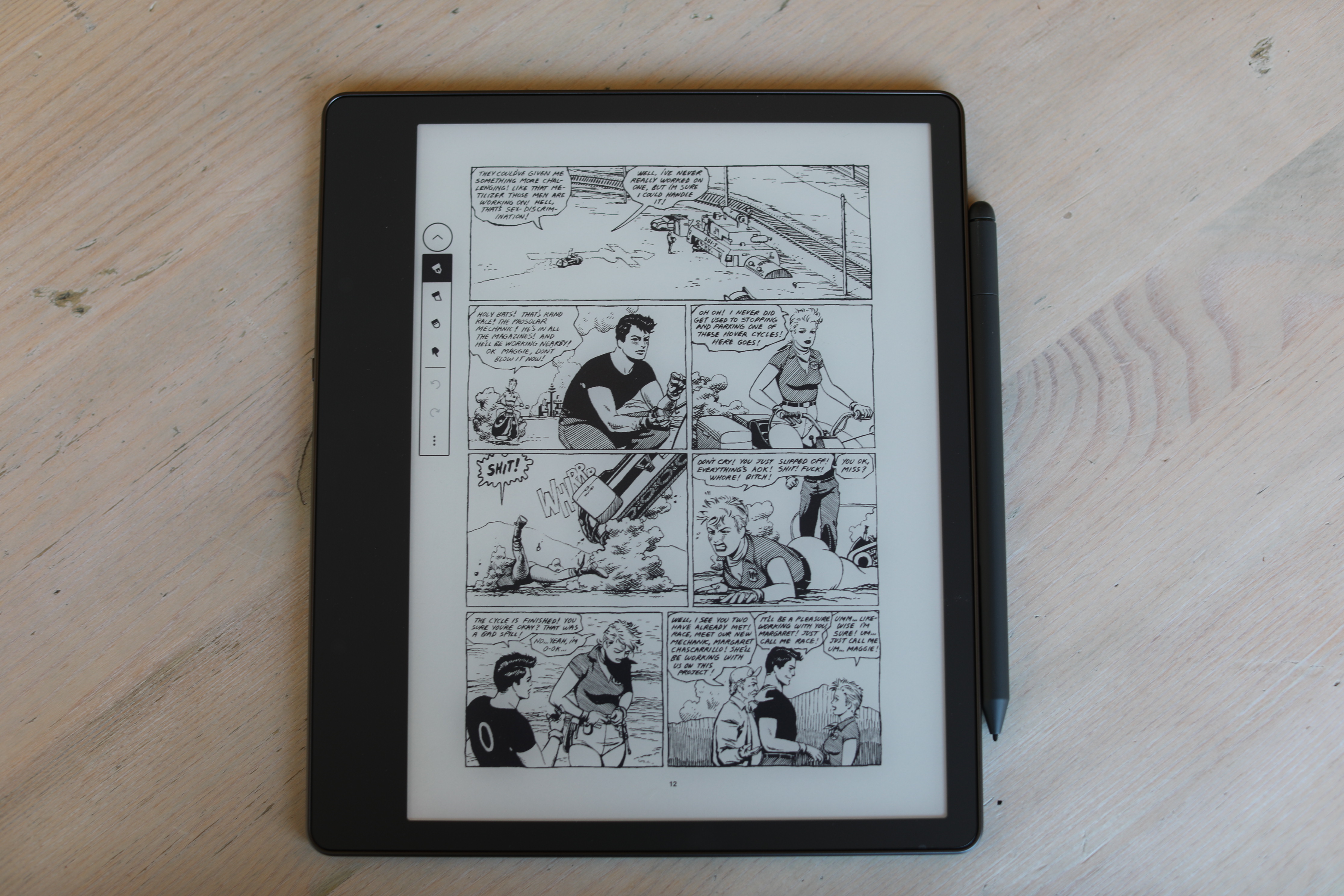
Image Credits: Brian Heater
For years, it felt like Amazon might never move on from micro-USB. I keep the cable around exclusively for my Kindle Oasis. It’s nice knowing I can charge the Scribe with the same cord I use for practically (ahem, iPhone) everything these days. The Scribe ships with a USB-A to USB-C cable, rather than straight USB-C. Not sure if that says more about Amazon or their perceived userbase for the product, but again, one of the big selling points with the new port is that you likely already have a couple of those cables already lying around.
Many of the recent improvements arrive on the software side. If you’ve got a mobile device handy, you can use it for quick setup. Sign into the Kindle app on mobile, click “Amazon Device Simple Setup” and “Set up with your phone” on the device, and you’ll be up and running with a synced library in a minute or two.
I’m a longtime Calibre user. In recent years, Kindle Oasis+Calibre has been an ideal e-reader experience. The app is good for a number of different things, but the topline feature (for me, at least), is the ability to convert ePub files to a Kindle format and send them directly to the reader. It’s long been the best workaround for Amazon’s walled garden approach to selling books. Earlier this year, however, the company finally added support for ePub, the default e-book format outside of the Kindleverse.
Add to that some big improvements to features like Send-to-Kindle and the company’s taken a big dent out of what made Calibre a great third-party app for many users. There are still reasons to use the service, of course, including an off-device method for organizing your files, but Amazon’s dramatically improved the experience for people who want to purchase books outside of the Kindle store.
For years, the entire Send-to-Kindle experience was lacking. Getting files onto and off of the device was a much bigger chore than it had any right to be. In its current iteration, Send-to-Kindle web is one of those things that feels like it should have been there from the outset. Open a browser, sign in and you can drop files directly into the interface. After a few minutes, Kindles connected to that account (and Wi-Fi) will sync, with the file appearing in their library. It’s not magic, exactly, but after so many years of what felt like pointless complexity, it kind of feels like it.
Streamlining Send-to-Kindle is particularly important, given that the ability to take notes on the device is central to the Scribe experience. It’s a way to send a PDF or other document directly to the device for markup. To get them off the device, tap Share and from there you can either do a “quick send” to the email associated with your Kindle account or manually enter another address. After a couple of minutes, the recipient will receive an email with the subject line, “Someone sent you a notebook from their Kindle.” Click Download and it will surface a version of the file hosted on AWS.
The other primary use for handwriting is taking notes in the book reading experience. If you’re someone who likes to make copious annotations, it could be a handy feature. While reading on Scribe, a small menu pops up in the left margin. Tapping on this lets you leave notes in specific spots within the text. There’s certainly potential value there for students and researchers who don’t want to juggle between devices to take notes.
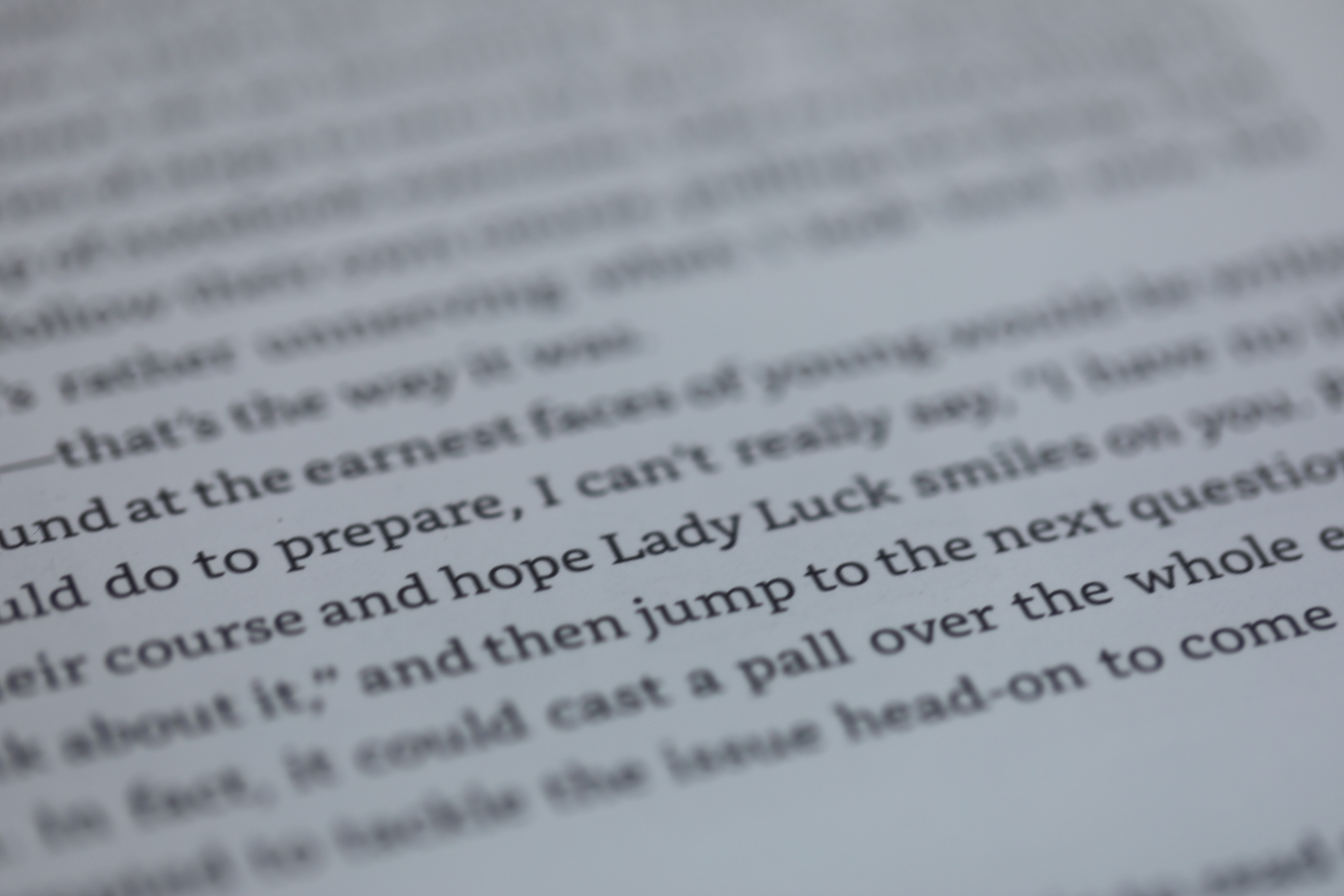
Image Credits: Brian Heater
The Scribe ships with a basic pen that magnetically snaps to the side of the device for safe keeping. Upgrading to the premium pen will add another $30 to the base price (this is the review unit Amazon sent along). The basic and premium pens can also be purchased on their own for $30 and $60, respectively, but keep in mind, the Scribe is the only Kindle they currently work with.
The premium pen adds a devoted button to switch between pen and highlighter functionality — I found myself accidentally triggering it from time to time, so that takes a bit of getting used to. It also has a built-in eraser on the top. Flip the pen over and apply some pressure against the screen to depress it and it will remove your marks (after a slight refresh delay). The pen is a passive stylus and doesn’t require any charging — so that’s one less thing to worry about.
The writing experience is solid for a first-gen product like this. There isn’t enough notable latency to truly be annoying. The pen against screen has a nice tactile sensation to it, along with a built-in sound that almost approximates pencil on paper. You can choose between five line thicknesses — though fair warning, the thinner the line gets, the clearer the pixelation becomes on the display.
The experience is good enough for note taking and even basic doodling, but it’s not going to replace a Wacom — or even iPad — any time soon for serious artists. That said, I can certainly see dropping this in a backpack to replace a coffee shop sketchbook or even getting some roughs down on the page before really drawing in earnest. The addition of drawing adds an exciting new dimension to the 15-year-old line. For now, it’s not necessary for most users, but it will be interesting to watch it develop over future generations.
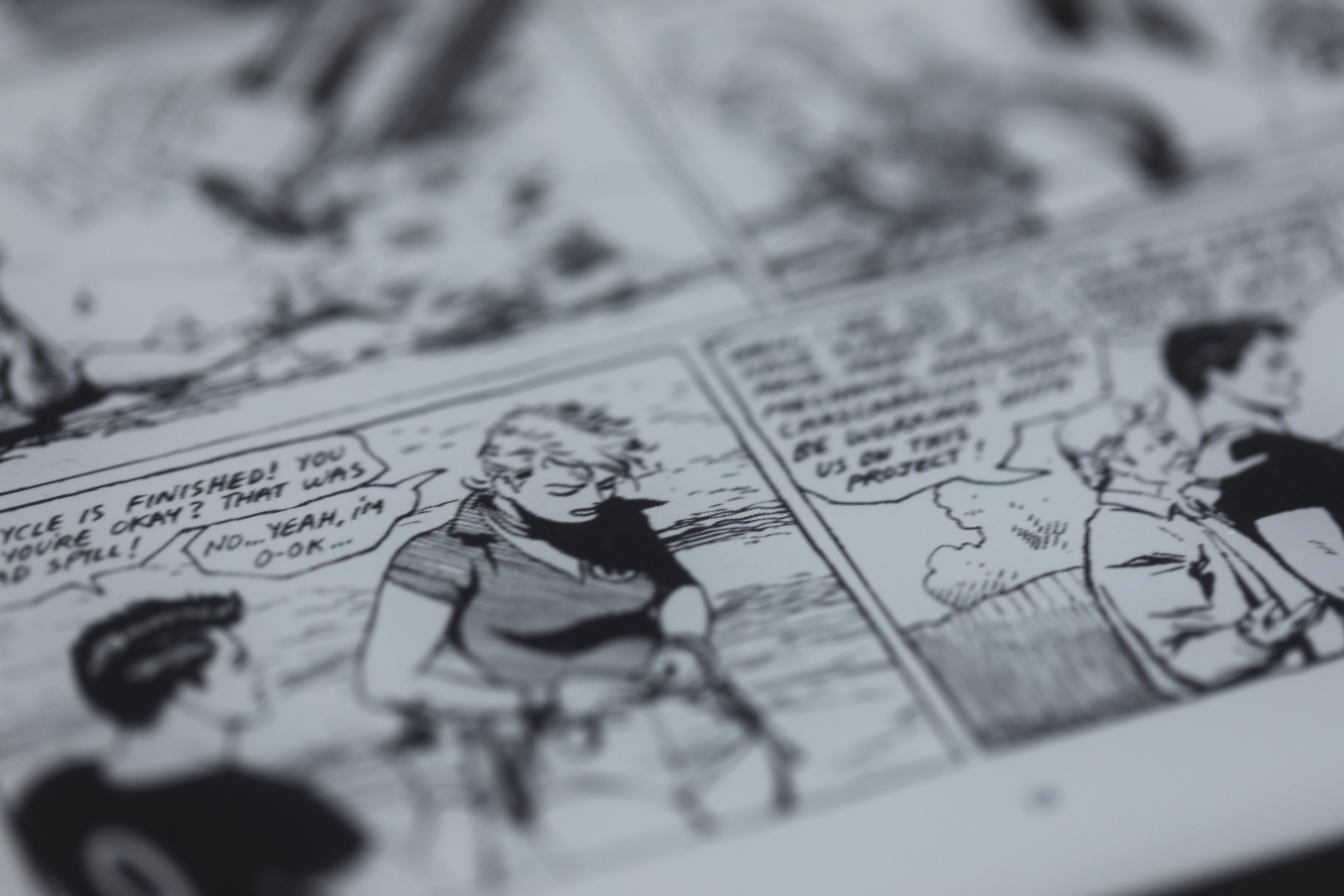
Image Credits: Brian Heater
At 300 DPI, the Scribe sports the same pixel density as the rest of the line. It’s great for reading and does a good job rendering black and white images. The system is actually a really great size and shape for reading comics. You’ll obviously lose something important if they were published in color, but for manga and a lot of independent press (see: early Love & Rockets pages above), reading PDFs are actually a pretty good experience. Refresh rates have dramatically improved over the years, though you’ll still run into some imperfections like ghosts of images after you’ve turned the page.
For reading text, however, you still can’t beat e-ink. It’s the easiest on the eyes and battery life. I quite enjoyed the larger page format, as well, though the device’s size means it’s a bit tough to read while lying down. Rather than holding it above my head, I found myself mostly reading on my side while in bed. If you’re purely looking for a casual reading device, again, the Scribe is overkill.
If the Scribe feels fully formed for a first-generation device, it’s because it was built on generations of Kindle iterations before it. The front light, for example, is great. The Scribe has 35 LEDs to the Oasis’s 25, presumably due to the larger size. Earlier generations had issues with uniformity, but Amazon has much improved on that front. Using a Kindle in 2022 makes you wonder how you got by before the advent of features like the auto adjusting light and warm light for before bed.
Interestingly, the Scribe and entry-level Kindle are the only two current devices in the line that aren’t IPX8 waterproof. My guess is you’ll probably get by okay without it 99+% of the time, but it’s curious to see the feature skipped in only the least and most expensive entries. There’s also no cellular option for the Scribe (again, interesting, given that it’s the default on the Oasis). It’s one of those things that’s nice to have (especially on the road), but you can get on perfectly well without.
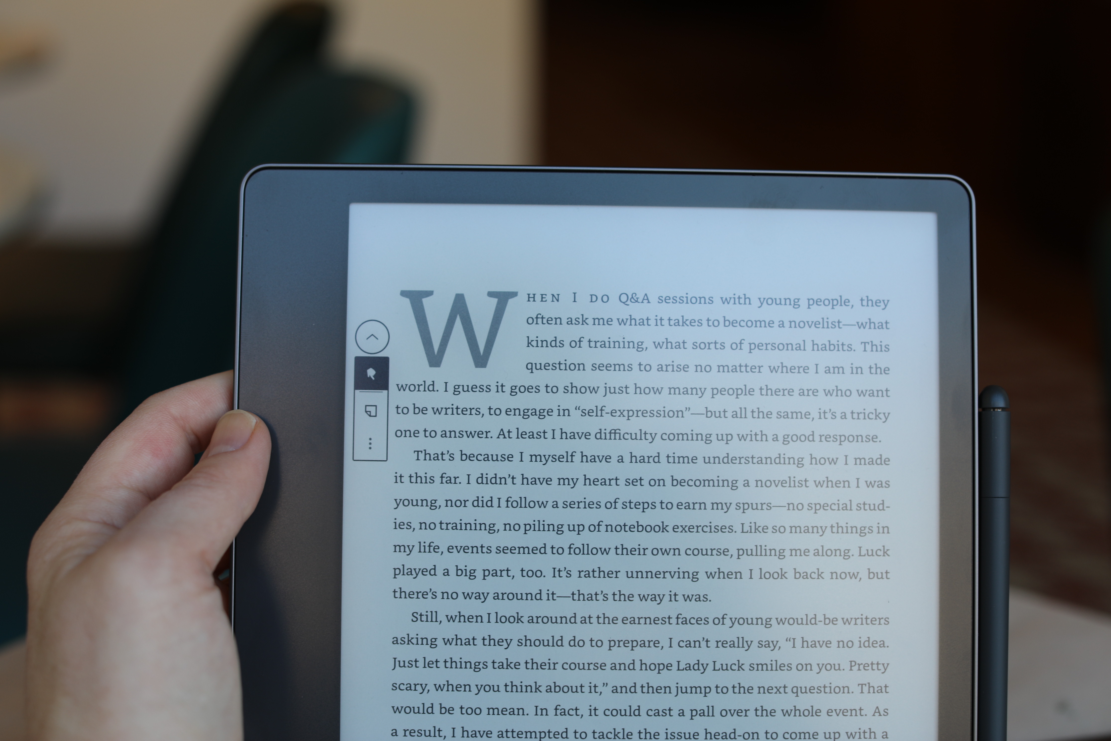
Image Credits: Brian Heater
As ever, there’s a web browser on board, and as ever, the Kindle is a less than ideal way to surf the web. Adding to the usual input, latency and formatting issues, it seemed to have difficulty rending basic language, as seen above.
Bluetooth, on the other hand, is now standard across devices. Pairing headphones with the Kindle is basically the same process as on a mobile device. There are some nice accessibility options there, with the availability of text to speech. You can also use the Kindle to listen to Audible downloads, though I’m still having trouble thinking of too many scenarios in which it makes more sense to listen to an audio book with a Kindle device versus the Audible app on a smartphone (though I admit that I rarely listen to audio books at all).
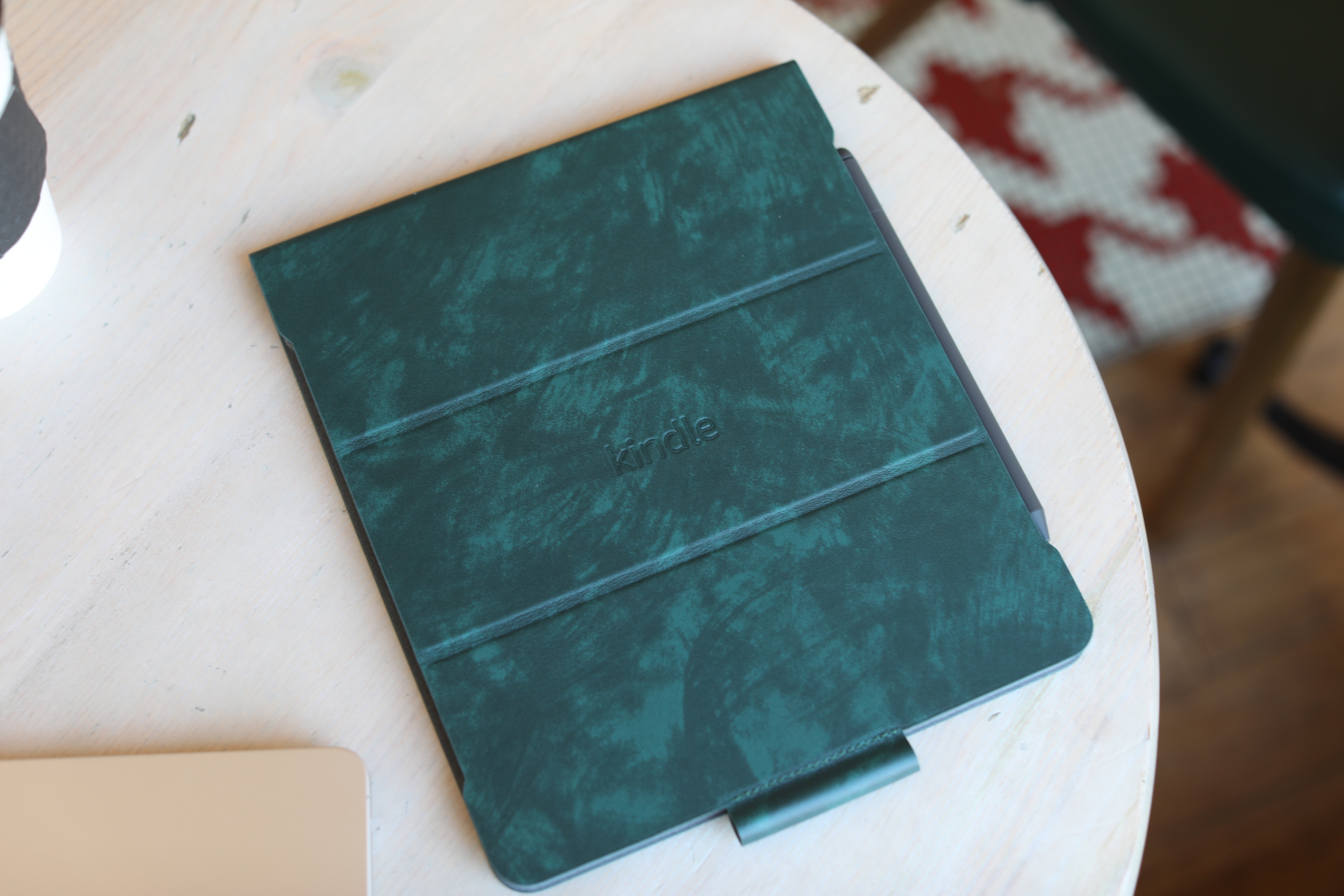
Image Credits: Brian Heater
As with other Kindle, battery is listed in weeks, rather than hours or days. That’s thanks in large part to the e-ink display. Due to the new content creation element, there are additional storage options. The Scribe comes in 16GB, 32GB and 64GB flavors. Only the 16GB version is available with the basic pen at the moment. The 32GB version will run you $390, while the 64GB is $420, meaning the top-end unit (with the default premium pen) is another $80 over the base price.
The leather cover is quite nice — and honestly, a cover of some kind is necessary if you’re going to be tossing this thing in a book bag. That will run you another $99. In addition to protecting the screen and back from scratches, the pen loop at the bottom is more secure than the magnetic connection. The cover can also be flipped back to serve as a stand, propping up the Scribe at a slight angle designed for writing/drawing.
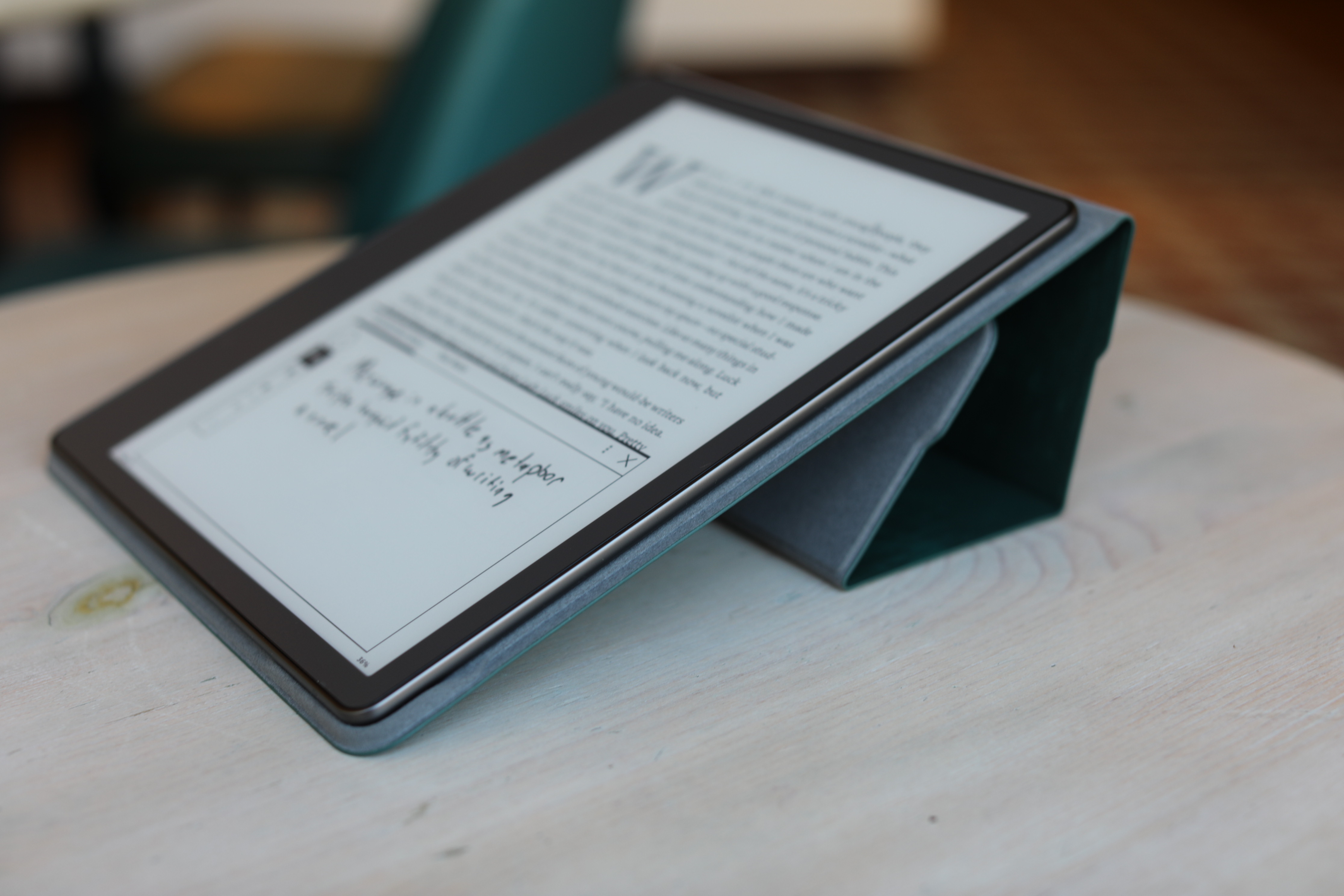
Image Credits: Brian Heater
It’s exciting seeing the Kindle take on an entirely new dimension after all these years, but for a majority of users, the price premium over the rest of the line is probably not commensurate with the value add. It’s also $40 over the starting price for the reMarkable 2 — though you don’t have buy into a monthly subscription fee here, and you also get a lot of existing Kindle ecosystem functionality.
For most people in most scenarios, the Scribe is going to be overkill, but it’s nice seeing Amazon explore new territory with a product line that is too often overlooked.
Amazon Kindle Scribe review by Brian Heater originally published on TechCrunch
DUOS


