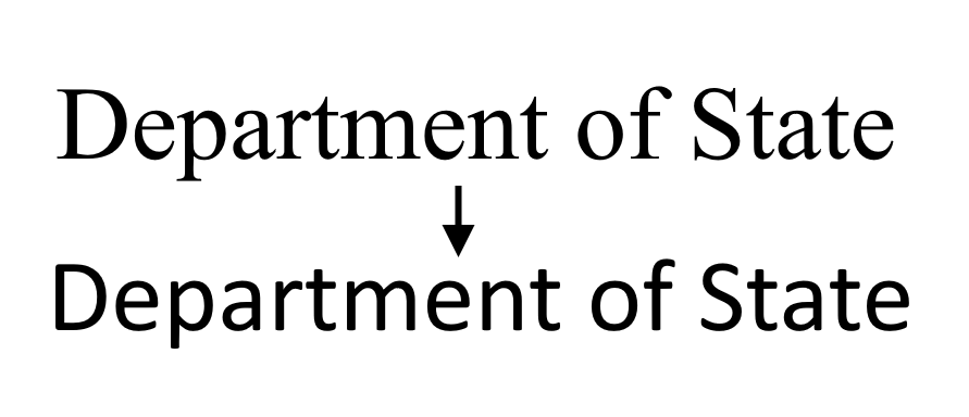
In a heartwarming callback to the absurdly low-stakes controversies of the Obama era, the State Department is making extremely small waves by officially retiring the old workhorse Times New Roman font from official communications. It will be succeeded by Calibri, a font best known now for being publicly retired in 2021.
Really, though, there is no furore (let alone furor) about this, since if anyone cares enough about fonts to say anything, they probably are so tired of TNR by now that their only complaint would be “what took so long?” But it’s funny that it’s in the news at all.
The Washington Post learned of the change from a leaked cable sent by Secretary of State Anthony Blinken — not quite the operational security I’d hoped for from them, but we would have found out soon enough. The reason for the change is accessibility and readability: a sans serif font (that is, without the little bits on the ends of letters) is considered by many to be easier to read at smaller sizes on digital devices, especially for those with vision impairments.
It’s a laudable goal, even if it isn’t quite that simple: a more readable font is a good idea, but accessibility needs to be built into processes from the ground up, not as a layer on top. Still, small steps count too.
Funnily enough, the State Department is taking the same step Microsoft did way back in 2007, when it itself replaced Times New Roman with the then-new Calibri as the default font for documents. The reasoning was largely the same: serif was more readable and people weren’t printing as much.

Times New Roman, top, and Calibri.
But that was a long time ago, and Calibri is now on its way out for various reasons, perhaps for its distastefully attenuated terminators. It’s not like it’s going to be purged from the Earth or anything like that — “not the default” isn’t a death sentence — but it’s definitely a bit strange to pick it as your “new,” highly official font given the circumstances.
It’s understandable that the federal government would generally prefer a product that’s been proven over many years of use. I don’t really expect them to switch to Roboto, or Source Sans, or even my preferred font out of the Microsoft replacements, Bierstadt. Although this one based on gerrymandered districts might have been appropriate:
It’s just that there’s actually a font made for this purpose: Noto. The collaboration between mega-foundry Monotype and Google is a totally free sans-serif font that was built from the ground up to accommodate all languages, symbols, and ordinary typography needs. It’s great for any government application that might need to be printed in several languages, but even more so for the wide-ranging State Department. But perhaps they have their reasons for preferring a Microsoft default to a comparatively exotic Google typeface. “Keep It Simple, State.”
Design fluency is not really a federal strength, but they seem to be improving — better than many state governments, I must say, which often have agency and official pages that look straight out of 2007 themselves. In this case swapping to a more suitable font, even if it’s aged and uncool, is a good move and perhaps the trickle that precedes a flood of good, thoughtful design — of which accessibility is a part and a consequence, not just a component.
Font furore as State Department retires Times New Roman for retired Calibri by Devin Coldewey originally published on TechCrunch
DUOS


