Today, Apple released Safari 16, a major point release that’s debuting ahead of Ventura. The browser update is mostly focused on things users can’t see, like security and performance. But there’s one new user-facing feature that’s been on my wishlist for nearly a decade — sidebar tabs.
Sidebar tabs aren’t a new idea, of course. Microsoft’s Edge offers it out of the box, and Chrome and Firefox both have extensions that enable the feature, and Safari did at one time, too. But the browser that introduced me to the concept — and really ruined other browsers for me given the elegance of its implementation — was OmniWeb.
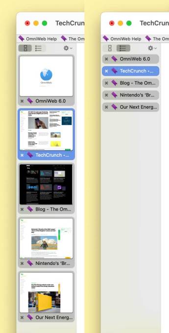
Twenty years ago, OmniWeb had a sidebar (a “drawer” in Interface Builder-speak) that faithfully rendered thumbnails of open web pages. They updated in the background and could be reordered by dragging them around. When tabs got too numerous, you could collapse them into smaller, text-only buttons. You could refresh the whole stack in just two clicks and see which pages had updated just by glancing at the thumbnails. For the web-obsessed in the early 2000s, it was a power user’s dream.

Image Credits: Tim De Chant / TechCrunch
For that crowd, vertical tabs are really the best way to go. Computer screens have been wider than tall for a while now, and putting tabs on the side of the window makes better use of that space, allowing users to view more of a webpage’s content. Plus, a vertical list is much easier to navigate when the number of tabs starts numbering in the dozens, something that happens to me all the time. (The screenshot shows how expanded and collapsed tabs appear in OmniWeb 6, which did away with the deprecated drawer UI element in favor of a sidebar.)
OmniWeb was arguably the first web browser available for Mac OS X. Before Internet Explorer was bundled with Mac OS X Developer Preview 4, intrepid testers could use OmniWeb for their browsing needs. The app had been originally made for NeXTSTEP, OS X’s precursor, with a beta available in 1995. Shortly after OS X developer previews became available, OmniWeb’s developer, OmniGroup, ported the browser.
The app was about as pure a Mac OS X experience as you could get. It was written in Cocoa, the then-new programming language that represented a clean break from classic Mac OS. Interface elements were in the lickable Aqua theme, and images and text were rendered using Quartz, the new OS’ compositor. Images were bright and the text was crisp and smooth. Oh, and it wasn’t made by Microsoft but an indie shop with a long history of cranking out solid NeXTSTEP and Mac OS software. For Mac addicts like myself, that was another strong selling point.
For a few years after the public release of Mac OS X, OmniWeb and Internet Explorer were pretty much the only two options for web browsing. Then Microsoft dropped IE for Mac, and Apple decided to get into the game, releasing Safari in January 2003.
Based on the open source KHTML rendering engine, Safari was fast and flexible, but it was sorely lacking the power features I had come to expect. It had tabs, but I found them clunky. It was also missing workspaces, toolbar search customization, synced bookmarks, and content filtering (with regex!), among others. I had grown used to them over the years, and I found it impossible to change.
Thankfully, with OmniWeb 4.5, OmniGroup decided to switch to WebCore, which Safari was based on. That gave OmniWeb a new lease on life, keeping it more or less relevant through the aughts and into the early 2010s.
In 2009, OmniGroup decided that it couldn’t continue devoting resources to OmniWeb, which started as a paid app and then transitioned to free. Chrome was muscling in, and most Mac users just stuck with what their computer came with, Safari. OmniGroup had started work on another major version, 6.0, and while it’s still updated today as a passion project, it’s not really a viable daily browser. For the most part, OmniWeb is dead.
When I realized the writing was on the wall, I tried a bunch of different browsers, including Chrome and Firefox, but I’m kind of particular about my user experience (if you couldn’t tell), and neither jibed with my expectations. At some point, I switched to Safari, leaning on a series of hacks to try to bring some of the most loved features with me. It’s worked OK, but it hasn’t been the same.
Until today. I feel like my browsing experience is once again starting to resemble those early days of Mac OS X. Over the last year, tab groups started to help me tame my Safari window overflow, and vertical tabs should help further, centralizing tab management in one place. At version 16, Safari is still not perfect — I’d still like to have thumbnail previews available for each page, and it would be great to turn off the now-redundant horizontal tab bar — but it’s much closer to the ideal than at any point in the last several years.
I’ve missed this feature since OmniWeb was shuttered — Safari 16 just brought it back by Tim De Chant originally published on TechCrunch
DUOS


