In its own words, Front is a customer communication hub that keeps teams focused on what technology can’t replace: ensuring every conversation strengthens the customer relationship. The company recently raised $65 million at a $1.7 billion valuation, which is a hell of a funding round. Uniquely, the company has actually published all of its past funding decks publicly, which means this is a rare opportunity to follow a company’s journey from its first growth funding round all the way through to the present.
From round to round, the company’s CEO Mathilde Collin outlines the evolution of the company and how it is positioned in the market. She writes one of the clearest breakdowns of how the purpose of each round has evolved:
- Seed: “We’re a good team with a large market opportunity.”
- Series A: “We have proof of product-market fit ($1M ARR)” — see the company’s Series A pitch deck.
- Series B: “We have leverage (we know how to spend money to grow faster)” — see the company’s Series B pitch deck.
- Series C: “We understand our market, which unlocks new levers of growth (outbound & upmarket)” — see the company’s Series C pitch deck.
- Series D: “We understand what’s unique about our position in this market, and why our mission matters more than ever.”
So, let’s see how knowledge of market position translates into a pitch story.
We’re looking for more unique pitch decks to tear down, so if you want to submit your own, here’s how you can do that.
Slides in this deck
Front’s pitch deck is an incredibly tight, 11-slide deck that opens with a mic drop, and, well, these must be some butter-slathered microphones, because it sure is slippery — the company just keeps dropping mics as the slides progress. On first skim, I’m getting nervous as I realize I have to find stuff I need to improve about these slides.
But! I’m feeling brave, so let’s give it a whirl.
- Cover slide
- “Front in key numbers” — traction-summary slide
- “Innovative, growing, next-gen companies use Front to align teams, execute faster & deliver world-class service” — social proof slide
- “A customer communication hub” — product slide
- “A massive market opportunity” — market description slide
- “Typical usage across our core use cases” — solution slide
- “A better product, at scale” — scaling slide
- “Strong fundamentals keep getting stronger” — metrics/traction slide
- “An ambitious vision few companies can deliver” — vision slide
- “Built for the long run” — summary slide
- “Thank you” — closing slide
The slide deck is very close to being as-pitched by the company’s founding team, with a couple of minor redactions. The company blanked out the revenue data on slide 2, it hid some of its customers on slide 3 and while slide 8 kept the graphs, the company removed the numbers from the axes.
Three things to love
First of all, this is one of the best slide decks I’ve ever seen. It tells a tight and compelling story without using too many words.
That’s how you start a pitch!

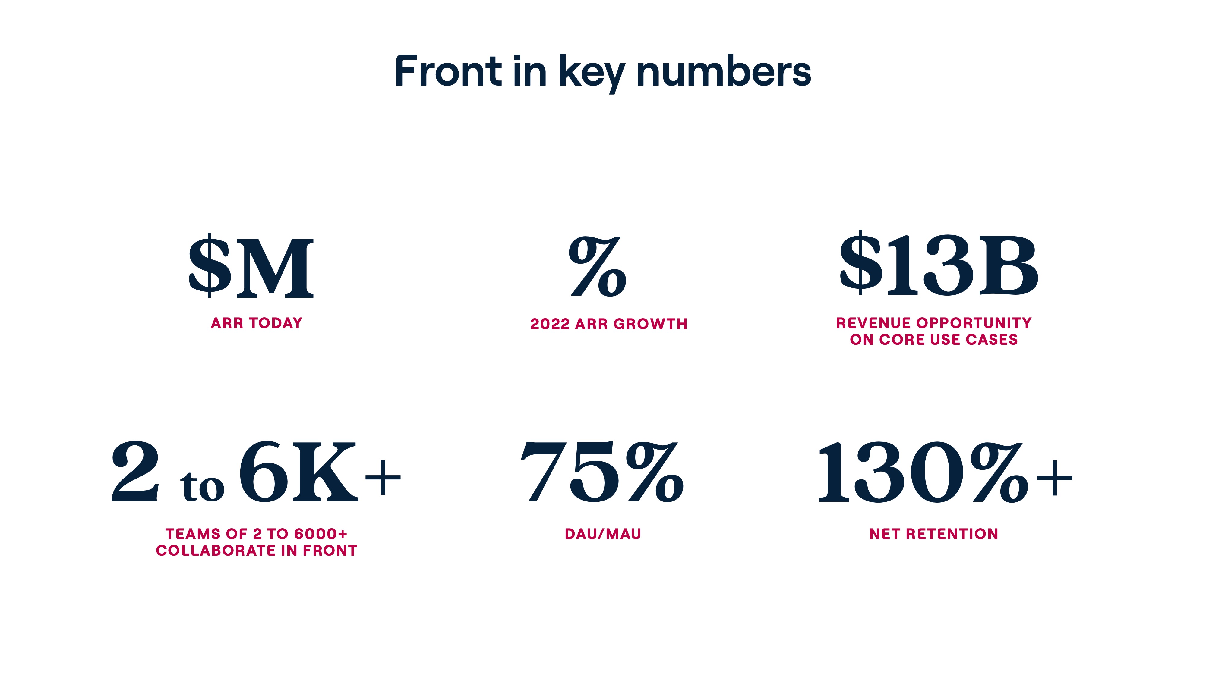
[Slide 2] Yassss. This is how you do it. Image Credits: Front (opens in a new window)
When you’re raising angel funds or your first institutional money, you can get away with raising with a vision, a dream and a sliver or two of hope. By the time you’re raising a growth round — typically your Series A and beyond — you need more than a wing and a prayer. And if you’re raising at a $1.7 billion valuation? Forget about it. Hard data proving that you’ve figured out what your market dynamics is non-negotiable.
Even though slide 2 is somewhat redacted, you get the picture: The company comes hard out of the gate and shows that it knows why it’s sitting across the table from a venture capital firm: Traction, baby, and a plan for what happens next.
If I were an investor in this space, slide 2 alone would be enough to get the company to a second meeting.
When you make it to your Series D, if you haven’t got traction, you’re dead in the water. That means unless you’re raising money for something new and spectacular (say, a whole new product or a brand new market expansion), you open with your traction.
So yes, Front got that right, but it also shows that it knows which metrics matter. ARR, ARR growth and retention are key. The rest of the figures are eye candy, but, I mean, look at that eye candy! If I were an investor in this space, this slide alone would be enough to get the company to a second meeting.
Owning the market

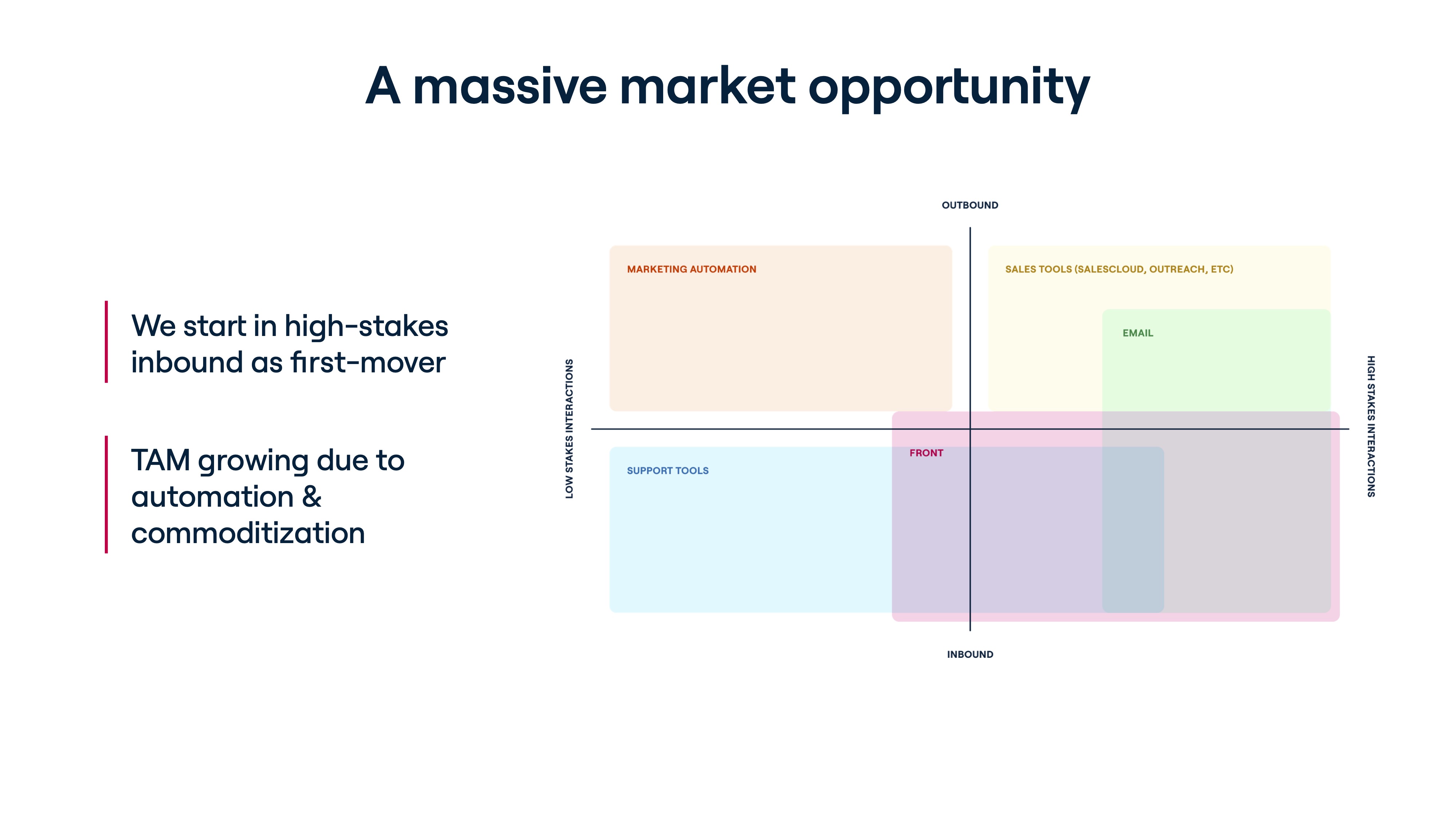
[Slide 5] “This is what we do” seen through a market lens. Image Credits: Front (opens in a new window)
Call me ignorant, but until Front submitted its pitch deck for a teardown (you can do that, too!), I had never heard of the company. Slide 4 is really elegant: It shows a screenshot of the product with callouts showing what its customers love about it. But Slide 5 nails the company’s product and its position in the market fantastically. It also does a really subtle thing, which I’ll get back to in just a moment.
I love a good two-by-two graph in a pitch deck, as it really helps show how a company positions itself in the market and how it differs from its customers. Front’s fifth slide can be read a few different ways, but when I look at it, I immediately noticed this: “If it’s inbound and important, use Front.” That means that the platform can be used for high-importance customer support interactions, inbound sales, inside sales and general customer communications.
That’s a hell of a slice of the market. It also shows that Front doesn’t compete with the large number of lower-impact customer support tools out there. Whether that’s a good idea can be left as an exercise to the reader, but it’s elegant, clear and it shows that the company has great discipline.
The other cool thing — the subtle part of this slide I just mentioned — is related to market expansion. One important consideration that pops into my mind when I see this slide is how the company could expand its market. There are two logical options: Either everything inbound (also take on the lower-value inbound communications currently covered by more generic support tools) or everything valuable (shift to also enabling outbound sales and marketing communications and take on Salesforce at its core business as well).
Either way, this is a clean slide that does a lot of heavy lifting, and I can see this causing a lively debate at a pitch meeting.
Flexing your customer use cases

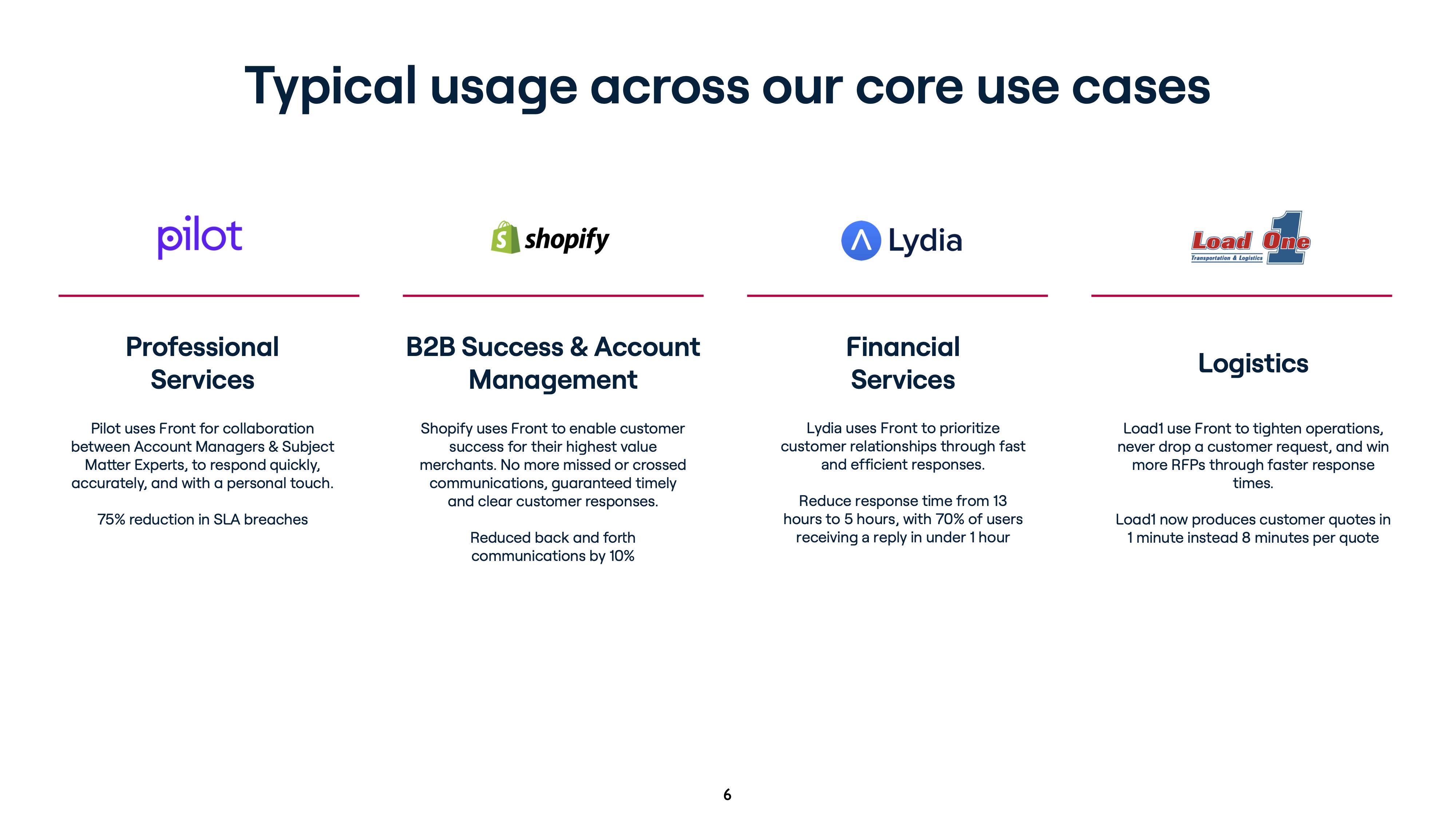
[Slide 6] Customer use cases. Image Credits: Front (opens in a new window)
Slide 6 had me shaking my head and muttering “yesss” under my breath. Apart from the fact that it has more text than I’d like, the company does a few things extremely right here.
First off, it shows off some of its extremely well-known customers. Pilot, Shopify, Lead1 and Lydia are well-established brands, and seeing them on this slide is a reminder of how far Front has come in its market penetration. The description of how each company uses the platform is genius, because all four use cases are pretty distinct, and it shows both the value and the flexibility of the tool.
The actual stroke of genius, though, is the final sentence on each of these use cases. Front avoided the temptation to talk about features or even use cases. Instead, it talks about the value proposition it offers each of these customer groups. Perfect, and exactly what you should be doing on a slide like this. A 75% reduction in SLA breaches? A 10% reduction in back-and-forth comms? Reducing response times from 13 to five hours? Anyone who manages inbound customer requests realizes how monumental those results are and the tremendous value Front’s tools bring.
It’s beautifully done, and I’ve bookmarked this slide away in my “This is how you do it” folder. You wouldn’t believe how many companies get this painfully wrong.
In the rest of this teardown, we’ll take a look at three things Front could have improved or done differently, along with its full pitch deck!
Three things that could be improved
Raising at a $1.7 billion valuation and the amount of effusive praise I’ve already poured on this slide deck is worth celebrating. But, as ever, there’s a detail or two I feel compelled to poke fun at.
That’s not how you do a competition slide
As much as I loved the market positioning slide (slide 5), I bristled at the lack of listed competitors. Yes, it’s possible that Front dominates its market. But that doesn’t mean there aren’t other tools out there that cover aspects of what Front does, and it seems a little arrogant not to include them as part of the narrative.
I don’t care how big you get, I want to know which competitors you’re keeping an eye on. And (possibly in the appendix) I want to see a SWOT analysis of the ones that pose an active threat or could do so in the future.
So, er, what are you gonna do with the money?
Front raised $65 million. That’s a lot of spondoolahs for any business, and my immediate question is: “What are you going to do with the cash?” I would have expected an operating plan in this deck, but it’s possible they have the long and near-term financials in spreadsheets instead. I don’t love that, but fine, I get it.
The only excuse I can imagine for not including near-future plans is if the fundraise is earmarked for an IPO, and the money will mostly go toward preparing the company for a listing.
What I don’t get, though, is that the deck is almost entirely backward-facing. I get that traction is crucial and impressive, but you raise money because you need the cash to change something about what the future of your company looks like. There’s nothing at all in this deck about this. Is the company about to expand its market? Will it hire more staff? Is it pivoting products? Is there going to be a marketing push?
The only excuse I can imagine for not including near-future plans is if the fundraise is earmarked for an IPO, and the money will mostly go toward preparing the company for a listing. If that’s the case, you want to play your cards close to your chest until it happens and not including it in the pitch deck might make sense.
Given that’s the only reason I can think of to not include future plans, I’m 70% sure the company will file an S-1 and run an IPO process next year. Front, if that’s the case, you don’t have to admit it; just send me a postcard or something with a smiley face on it once your S-1 drops. I called it ;-).
You can do better on the market side of things
As much as I love the market outline slide, it doesn’t say anything about size of the local or global market. That’s unforgivable, because for a company seeing aggressive growth, I’d want to learn how much more it can grow before it’s taken on its entire serviceable obtainable market (SOM) and how it’s going to expand its addressable market (SAM).
There’s no way Front hasn’t spent a lot of time thinking about this, and there’s zero chance that it wouldn’t have been challenged on this point in the fundraising and due diligence process. You may as well grab that particular bovine by its horns, get ahead of the conversation and stick it front and center on a slide.
The full pitch deck
If you want your own pitch deck teardown featured on TC+, here’s more information. Also, check out all our Pitch Deck Teardowns and other pitching advice.
DUOS


